
The Colour That Gets Dismissed Before It Gets a Fair Hearing
Orange has a complicated reputation in interiors. It got overused in a particular era of home decorating, and a generation of people grew up associating it with rooms that felt slightly chaotic and not entirely comfortable. That history has made a lot of people instinctively cautious about introducing it — particularly in lampshades, where the colour is not just decorative but actively involved in how light behaves in the room. The assumption tends to be that orange will make everything feel too warm, too loud, or too visually busy. In practice, that is rarely what actually happens when the shade is chosen well and placed thoughtfully.
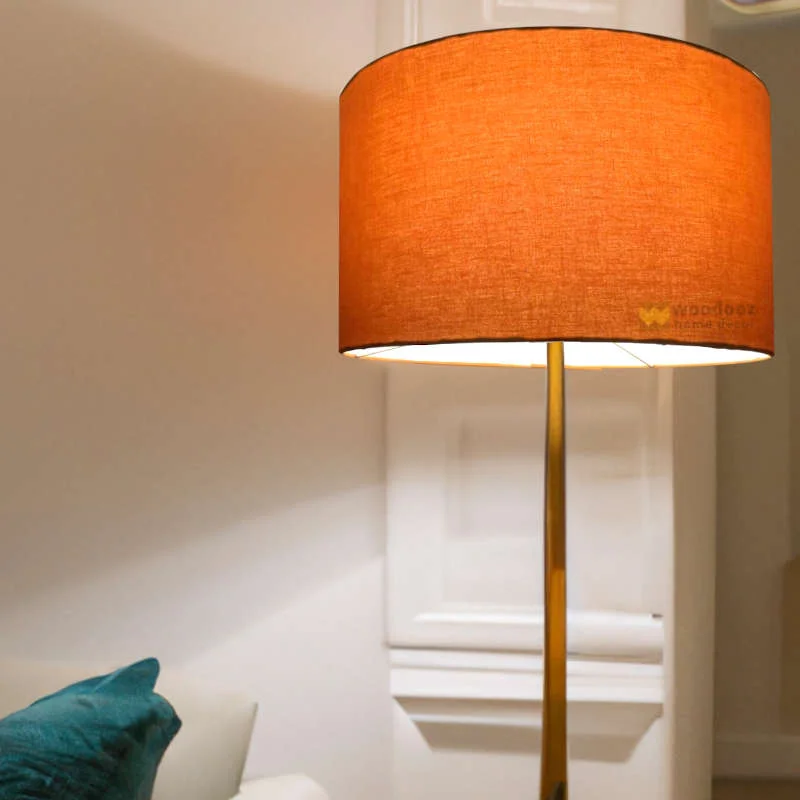
What Orange Light Actually Does When the Lamp Is Switched On
Here is the thing that surprises most people who try an orange lampshade for the first time. The light that comes through it is warmer and more amber than the shade colour itself suggests. A deep, saturated orange on the outside produces a light that reads as golden and rich rather than vivid or aggressive. The Autumn Leaves Cotton Lampshade in a straight empire shape does this particularly well — the warmth it produces when lit creates an atmosphere that feels genuinely autumnal in the best sense, rather than the garish version people tend to fear. Apricot tones, like the Zigzag 20cm Tapered Lampshade, behave similarly — the light output is soft and flattering, and the shade itself has enough warmth to read as a considered choice without dominating the room.
The Size and Placement Question Matters More Than the Colour
A large orange lampshade in a small, pale room with minimal furniture will draw a disproportionate amount of visual attention. That is not an orange problem specifically — it would be equally true of a large shade in any strong colour in the same context. The Ikat 40cm Tapered Shade and the Ripple 35cm in Coral Pink Ripple are mid-sized options that sit comfortably in most rooms without overwhelming them. Scale the shade to the lamp base and the room rather than choosing purely on colour, and the orange reads as intentional rather than overwhelming. In a larger room with darker walls or richer textiles, orange lampshades can actually provide exactly the warmth and energy the space needs.
When Pairing With a Neutral Lampshade Makes the Most Sense
Not every lamp in a room needs to take the same approach, and this is where the combination of orange and neutral lampshades becomes genuinely useful. A room with one orange shade and one neutral lampshade — say, a Taupe Silk Straight Empire or a Pearl Grey Ripple elsewhere in the space — uses the contrast deliberately. The orange brings warmth and personality. The neutral lampshade provides balance and stops the room from tilting too far in one direction. This kind of layered approach to shade selection produces rooms that feel considered and lived-in rather than decorated to a single theme and then left to stand there rigidly.
The Answer Is Usually No, With One Small Condition
Orange lampshades do not make a room feel too bright. They make it feel warmer — which is a very different thing. Bright suggests harsh and uncomfortable. Warm suggests welcoming and relaxed. The condition is simply that the shade needs to be the right size, in the right spot, with a bulb that is not working against it by pushing the colour temperature in the wrong direction. Get those details right and orange becomes one of the more rewarding colour choices available in lampshades — one that delivers something no neutral lampshade ever quite manages on its own.