
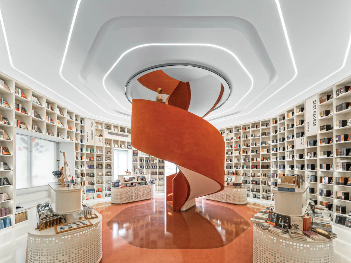
An awkward floor plan does not always look problematic on a drawing. The difficulty appears when customers hesitate at the entrance, miss an important range or reach a dead end with no clear reason to turn back. Columns, narrow sections and uneven room shapes can interrupt movement, yet they can also create useful moments when the layout gives each feature a job.
The first step is to identify where the journey breaks. A retail store design company may map the routes people naturally take and compare them with the areas the business wants them to see. Staff observations can reveal repeated questions, crowded points and displays that attract little attention. The aim is to find the cause of the behaviour rather than assume every quiet area needs more signs. Sales data may support the review, but direct observation shows how customers reach each decision.
The entrance often sets the pattern. A doorway placed to one side can send most visitors along the nearest wall, leaving the opposite area unseen. A strong focal point deeper in the store can pull attention across the space. The first fixtures should support that view instead of forming a barrier or asking customers to make an immediate sharp turn.
Narrow passages need discipline. Adding extra stock may seem commercially useful, but it can make movement uncomfortable and hide products behind other people. Keeping the route clear can improve sightlines and make the surrounding displays easier to read. Where the width changes, a small feature or change in product story can make the transition feel intentional.
Columns are another common obstacle. Trying to hide them with bulky structures can consume valuable floor space. A column may work better as a navigation marker, graphic surface or boundary between categories. Any treatment must respect visibility, maintenance and building requirements, but the design can turn an interruption into a recognisable point on the route.
Dead ends require a reason to visit. A specialist service, fitting area, destination product or engaging display can draw customers towards a remote corner. The route there should offer supporting products rather than long stretches of weak presentation. Once people arrive, they need a clear view of how to continue or return without feeling trapped.
An unusual room shape can also support a sequence. Wider areas may hold discovery tables or comparison displays, while smaller sections suit focused ranges that benefit from quieter browsing. A retail store design company can use these changes in scale to vary the pace. The important point is to match each zone to a behaviour, not fill every space with the same fixture type.
Sightlines should connect the sequence. Customers rarely study a full plan before moving. They respond to what they can see next: a lit wall, a clear category sign, a product cluster or a member of staff. Each visible cue should answer a simple question about direction or interest. Too many competing cues can create the same confusion as having none.
Service positions may need reconsideration. A fixed counter in the wrong place can divide the floor, block a route or leave staff unable to see quieter zones. Sometimes the counter can become a helpful anchor; in other cases, smaller service points or mobile assistance may work better. Operational needs, security and access must guide that decision.
Testing is valuable before permanent work begins. A retail store design company can use temporary trials to compare several route options. Temporary tape, movable fixtures and simple mock-ups can show how proposed routes feel at real scale. Staff can watch whether customers notice the intended destination and whether busy periods create pressure points. These trials often expose problems that are difficult to judge from a plan alone.
A stronger customer journey does not require disguising every awkward feature. It requires clear choices, purposeful destinations and enough space for people to move comfortably. When the floor plan is treated as a series of connected decisions, limitations can give the store character while the route remains easy to understand.